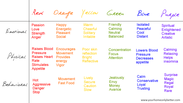
Color has a huge impact on us emotionally, physically and yes, even behaviorally.

According to the color guru’s at Benjamin Moore, we are looking forward to some connecting trends for 2013. I love how they related color trends to real life.
But first, let’s get some perspective from trends from the past two years:
- 2011 was all about Balance in an uncertain world. Key influences on color and style trends were: farm, order, escape and tribe. You can read more about it here.
- 2012 evolved from Balance to Preservation. As our world continued to feel uncertain, the key influences were: heritage, process, protection and enlightenment. You can read more about that here.
 And 2013 is looking forward towards an intersection of style and timeframes. While our world continues to feel uncertain, we desire to make sense of it all and find comfort in our surroundings. Benjamin Moore’s Andrea Magno says it best “As we look to the future, we find that our ideas are rooted in the past. What’s new is in the details.”
2013 Color Trends: Intersection
The key influences for the 2013 trend “Intersection” are as follows:
- Flow
- Cycle
- Animate
- Connect
Flow
 Flow is all about the past evolving into a modern day interpretation, but with a familiar ring. We find comfort in past memories, but want to express ourselves through a modern voice. This is where you’ll see more retro colors and textures showing up in our homes. Subtle details can transform old into new. I like to call it “Fresh Comfort.”
You’ll see more handmade crafting over mass production, art from scrap materials, and a mix of traditional and graffiti. Think painted furniture.
We’ll see a return to simple and uncomplicated 50’s styling. What was old is now new. Hmmm, I wonder if some of this influence is driven by the baby boomers entering a new phase of life? Your thoughts?
Cycle
 This influence is near and dear to my heart. Forward momentum turns useless into something even better through upcycling.
“This is not reduce, reuse, recycle you’re thinking. Most recycling is down-cycling. We want to upcycle materials for infinite human beauty.” ~Ben Hammersley
Giving materials a second chance is inspiring. Its spirit rings true of the original American Dream. Any “useless” or “unwanted” material can be reinspired, reimagined, and repurposed in a way that results in sustainable beauty.
Animate

Yes, life is a little serious and uncertain at times, but we still have an emotional need to for fun! It’s like opening a brand new box of crayons. Bold colors, cartoony lines, spontaneous, whimsical. Can you feel it? It is motion.
Retail will become more interactive in a fun way, much like the virtual gaming world. Go ahead, play a little!
Connect
 There is no denying it – the digital world impacts our reality. Admit it, how many of your Facebook friends have you actually had a cup of coffee with? Do you think we’re more connected, or disconnected in this digital age?
Either way, we’re seeing the influence of technology as fine art, “time” is becoming the new luxury and we’re all feeling the affects of social isolation in a digital world. At the end of the day, we want to connect meaningfully.
Color Trends 2013
So how do these trend influences affect color trends? I’ve always advised clients to pick colors they like rather than “what’s in,” but within each favored hue are subtleties that change with the times. Let’s look at each color or the rainbow and identify how to interpret these colors for your home in 2013:
Red

(via)
- You’ll see both blue and orange undertones.
- There will be more textural influences the colors.
- Classic red will continue to prevail.
- You’ll also see reds paired with bright pinks and oranges.
- Keep an eye out for soft pinks paired with yellow as well.
Orange

(via)
- Orange is an energy color. It is direction and influential.
- You’ll see oranges ranging from red to brown undertones.
- Bold coral will show up to play.
- You’ll also see more muted caramel oranges for a more sophisticated look.
Yellow

(via)
- We’re seeing more yellow everywhere! Perhaps because it’s a happy color.
- It’s nicely paired with grays, purple and magenta.
Green

(via)
- Green is fun. Kelly green, grass green. It’s a punch of color that makes people smile and feel connected to their earth.
- There is a big range of greens for 2013. Soft greens are soothing, retro greens are comforting, blue-greens are fresh.
Blue

- We’re seeing everything from navy to muted blue-gray tones to teals and retro turquoise.
- Blue is versatile, it can be both nostalgic and modern.
Purple

(via)
- Purple is everywhere in 2013! From muted to bold.
- Soft and gray-toned purples are also being used as a neutral.
- Keep an eye out for more berry inspired purples as well.
- Think “sunset” for how to use purple.
Neutrals
- You’ll see more interesting undertones give neutrals either a warm or cool cast. They can be used together and layered for complex results.
- The vintage look is big, so look to reclaimed wood, creams and knit textures in neutrals.
- Along with new uses for old things, consider rust as a neutral, and find ideas from natural wood grains.
- Light soft peach is making a comeback as well.
- Whites will be cooler, cleaner, almost glass-like.
- Black continues to be the new black.
- But perhaps the most interesting trend in neutrals for 2013 is the charcoal family. You’ll see complex undertones of blues, purples and pinks.
I love the fact that although times are still uncertain, life and beauty continue to evolve in a meaningful way. Color is such a powerful way to express yourself through your home. These trends really speak strongly to the chaos we live in, as if to declare that the times we live in may influence, but not control our future.
This reminds me of the serenity prayer “God grant me the serenity to accept the things I cannot change, the courage to change the things I can, and the wisdom to know the difference.”
Ok, enough philosophy – what rooms are you thinking of updating in 2013, and what colors will you use more of? Which influences do you relate to?


8 comments
Thanks for stopping by and for your wonderful compliment!
Thnks for the great post. I can never get enough information about color and color trends. Glad that I stumbled upon your blog, you’ve got a new fan.
This year I am so excited with so many different new colors that I am seeing. Perfect timing because we are about to change the color of our home, I am with my kids on this project, so I am expecting a real battle when it comes to color choice. LOL! Your collection of color trends for 2013 is really remarkable! I am thinking of neutrals and I fell in love with orange too!
Nicely put!
Great color combinations. I think we will be looking forward, but continue to bring threads of the past with us. I see us rising from the ashes of a type old Pompeii into a new vintage-classical…both romantic and strong.
So Interesting Color combination…..
Amazing post. Thanks for sharing..:)
Nice post. Thanks for sharing.