Have you noticed that when you go to the store to buy toothpaste, there are so many choices that it’s overwhelming?
Do you want whitening, tartar control, fluoride, sensitive, gel or paste, sparkles, or one of my favorite…”pro-health night toothpaste” (huh?). And the price points are varied as well, anywhere from $2 to $5 – quite a dramatic range for a simple tube of toothpaste. Seriously, it’s too much! Lol
Paint is confusing as well. Paint manufactures are trying to differentiate themselves on quality, ease of use, environmental friendliness, value and color trending.
For most homeowners, color selection is the most prominent decision point. It doesn’t matter how well the paint goes on and stays on if the color is wrong. Companies like Benjamin Moore and Valspar have been successful in becoming opinion leaders in color trends.
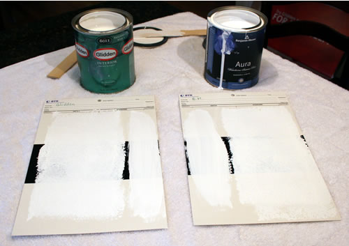
I was recently approached by Glidden to sample their new reformulated paint. They are so confident in the quality of their product that they asked me to compare it to the popular Benjamin Moore Aura paint. Here’s the kicker, the price did not change, just the product.
So of course, I had to see for myself.
Here are the paint test sheets when dried. Do you see any difference?

Will I consider buying Glidden paint for my next project? Sure! But, like most homeowners, I want to make sure it’s a color I can live with.
Here are a few tips to help you find the right color for your project:
- Test, test, test! You’ve heard this before for a reason…colors look different in different lighting. Spring for a quart or test-sized can and slap a few brush strokes on the wall and observe the color at different times of the day.
 Don’t fear bold colors. If you want a contrasting deep brown, a latte will look washed out against neutral furniture. Go with the chocolate brown, and brighten the contrast with trim and furnishings. Here’s a great example from Pottery Barn where dark walls work well with white accessories.
- Balance and flow. Coordinate colors choices for rooms that are visible from other rooms, and keep the balance of colors throughout a floor. For example, a brick red living room would not balance well if the other rooms on that floor are light neutrals. Select a few coordinating colors that place nice together, then mix and match them throughout your home.
- Accent colors. Look for accent color inspiration from a color wheel. You can find punchy accent colors by selecting a color on the opposite side of the wheel, or next door to your selected color. Or how about mixing shades of the same color for a tone-on-tone effect?

Bottom line…paint remains the best bang for your buck to update a room in your home. Why not tackle a room this weekend and try something new! What’s your next paint project, and which brands and colors are you considering?
BONUS GIVEAWAY! Post a comment to be entered in a drawing to win this oh-so-cute mini paint kit to make it easier for you to test colors before you commit. Yes, it even comes with the shameless plug Glidden T-Shirt. You can never have too many paint supplies, right?

Contest Rules


5 comments
Hello. I am trying to find out where I can purchase a Glidden Gets You Going Tshirt and I am not having any luck. Will you please let me know where I might look? Thank you. ~brenda
Thanks for the post.
We are beginning to dig the hole TODAY (or, ahem…tomorrow…ask the city when they print the permit) on our new home. So my “painting project” is an entire home. 🙂
The first home we built was all yellow and blue and it was joyous. Our next was blue and yellow, but was added green. This home (hopefully our last!) will (must!) have yellow, but will probably drop the blue and go mostly with yellow and green.
Here’s my problem, I love, love, love yellow as a main color. It is light and open and happy. And it’s almost neutral (kind of a light buttery yellow). But in the next house I’m really liking the idea of autumnish colors and not quite sure how to mix that look without going dark. I like lots of color, but not dark colors. They feel gloomy to me.
Any ideas?
.-= Alison Moore Smith´s last blog ..Building Permit Coming =-.
Interesting points! I’ve used just about every paint brand out there, and each have their pros and cons and unique selling points (just like toothpaste). I have also noticed that many folks are committed to one brand or another without knowing why. I recommend getting the best quality paint that fits your budget, and then make sure you get the right color. I change colors every 2-3 years, so durability is not a big deal to me.
Brilliant move by Glidden to send this to you except there are a couple problems. 1 – the Aura looks better. 2. They sent you white, which is the easiest type of color to cover because it has the most titanium in it. If they sent you a deep color, the likelihood the glidden would cover AT ALL would be low. 3 – From the video, it looks like they sent you low quality applicators. There is a standing rule in paint that says a bad applicator can ruin any paint, no matter the quality. 4 – Hide is just one aspect of paint. Sure it covered ok, but how durable is it? Can it stand up to washing or scrubbing? Does the color rub off on your clothes if you brush against the wall? If you had to paint an entire wall, would it be easy to put on, or a nightmare (like Behr).
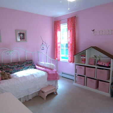
great post, Susan! You are so right, for me, the bottom line is color. And I have never backed out on a color choice yet, until this last one…started to put it on the wall, and didn’t like it one bit…at least, I only wasted about a half hour…so, I’m off to test some light shades of green for my girls playroom…hopefully, I’ll get it right this time!