As you know, I love using what I already have to create a new space. I call that PRACTICAL! We brought our curtains with us from the last house, and reused them in our Family room. So here is the question: what is the best way to hang curtains? I’m a big believer in high and wide for drama and spacial illusion! Here’s an excellent illustration of how placement of curtains changes the illusion of window size:
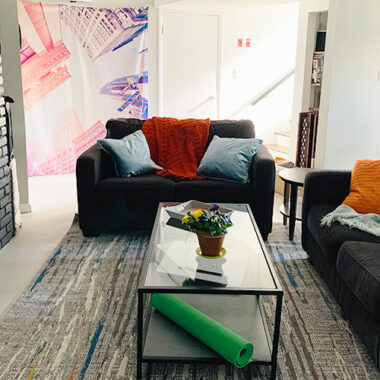
Previously, I shared our future plans to knock down a wall and combine our small, narrow family room with the neighboring kitchen. But for now, it remains small and narrow.
To give the illusion of width (and add texture), we re-hung the panels along the entire back wall, and as high as possible.
Here’s how the room looked before:
And here it is with the curtains hung high and wide:
Note: the curtains were 96″ panels and needed hemmed (which I had been conveniently putting off doing). After raising the rod, I only had to hem them 3″.
Tip: If your windows are odd dimensions, don’t be afraid of ordering longer-than-you-need panels and hemming them. Stitch Witchery is a handy little short cut for those who don’t like to sew. You just iron it on and the heat fuses the fabric together. Of course, Ironing isn’t fun either, but it was worth the effort.
So how are your (curtains) hanging?




4 comments
Great tip! Thanks!
Thanks Susan. Sending you some pics for your valuable opinion.
Wow, you’ve given me a lot to think about! My initial instinct is that less is more when it comes to windows – especially when selling. Painting the window trim white is a great idea. If you want to send me a couple photos, I’d be glad to take a look. susan (at) yourhomeonlybetter (dot) com.
Susan, I love your blog and all your posts. I am in the 6 weeks away from putting my house on the market and doing as many cost-effective projects as possible so that it presents well. I’m following several of your posts and will comment on them individually but some are rather old and you may not be monitoring them anymore. I just don’t have anyone to bounce ideas off of and would love to get input from you wherever possible.
Regarding the High and Wide Window Treatment post, I love the effect this had on your family room. I don’t have separate living and family rooms but one great room 26′ x 20′ with a ceiling that vaults from 11′ at the north end to 22′ in the center. The north wall is 20′ wide with three 4 1/2′ x 10′ windows equitably spaced. Though the window frame is 10′ tall (starting 1′ below the low end of the vaulted ceiling), it is actually made up of one 7 1/2′ double pane window and one 2 1/2′ transom. Hopefully this explains the framework. I’ve lived in the house for 21 years (first and only owner.) When I first moved in, I had a window treatment designer come in and make a recommendation. We put in cellular shades (pretty expensive back then) but just to cover the 7 1/2′ double pane window. Nothing covered the transom. I later added a matching sheer scarf valance for each window that was long enough to slightly swag the 7 1/2′ double pane and land just above the floor on each side. I hung the valance over aged pewter rods. Again, nothing over the transom. I am completely repainting the inside of the house and am currently leaning toward a light taupe color for the great room. The windows are stained Honey Oak, a rather outdated color now, and I’m considering painting them white so they stand out against the new color. The shades and scarf valance are burgundy. So, I’m wanting to insure the house shows updated and I’m not sure these window treatments are going to stand up to that test.
So, after all of this, how do you think sheer curtains would look if I hung them at 10 1/2′, close to the ceiling, down to the floor? Wouldn’t I need to nix the shades if I did this? Since it’s a north window, quite a bit of sun comes in through the windows during the day. Do you think I should consider something other than sheers? Or should I just let the window treatments in place stand as is? The shades are in good shape but they are 21 years old. They’re not fresh from my perspective and I want everything to look fresh.
Any suggestions or ideas would be greatly appreciated!
Thanks for your time.