Then I read this:
On average, a midrange (meaning not upscale) minor kitchen remodeling project costs $21,695, according to Remodeling Magazine. While expensive, it’s cheaper than the average major kitchen renovation, which runs $58,367 on average. ~smartmoney.com
Want to see my new $58,367 kitchen? I would too. But sadly, that will have to wait. How about my $21,695 kitchen? Ummm – not yet. BUT – I can show you my under $200 kitchen.
I hesitated doing anything in this room because often, if a room gets to “good enough” or “ok for now” then now becomes forever.
But I couldn’t take the yellow walls, taupe trim, sunflower/butterfly border, teal plastic chair rail, and (my biggest gripe of all) no knobs on the cabinets any longer.
So we set out to see what a little paint, cabinet hardware, some DIY and creative accessorizing can do for a kitchen, for under $200. First, the plan (be patient – oodles of before and after pics further down!)
Inspiration: New Jersey Diner

Very easy and simple to do. Neutral canvas with black and red accents. And don’t forget the silver bling!
 Paint Choice:
First of all, we had to remove the wallpaper, border and chair rail. A simple mix of water/vinegar spray and persistence and teamwork got that done in about 2 days (thanks hubby!).
Our paint choice had to coordinate with a taupe backsplash, wood cabinets, and forest green countertops and floor.
We had to pick a color that would blend well but not take center stage. Sort of disappear in a non-offensive way and let the pops of color do their thing.
We chose Behr Silver Dust – very neutral with a touch of gray to play with the grout and the back-splash and floor.
And it was a huge relief to paint the taupe trim in semi-gloss white. Nice and crisp!
Accessories:
As luck would have it, I had impulsively bought a red Keurig machine last year, and already had some red retro canisters.
To add some color around the window, I took two Crate and Barrel dishtowels (tomato print), folded them lengthwise and clipped them to a pressure rod. Cheap and fun! (Can’t say that about too many things, huh?)
If you’ve read my post “Ideas for that awkward space above the kitchen cabinets” then you can appreciate my dilemma. Builder’s grade cabinets paired with 9’ ceilings and no crown molding results in a problematic proportion. So, I scored a couple giant, whimsical utensils at HomeGoods and perched them above the cabinets. Minimal dusting required.
And finally, I needed art with personality. Seeing how I was already nearing my $200 budget, I turned to my friend, the Internet, to find artistic photo’s of diners and used frames I already had.
A couple in the eat-in area:
And three diner object compositions by the back door:
And of course, we added brushed silver knobs and pulls to the cabinets and drawers. Talk about relief! That was driving me nuts.
Before and After Shots
Ok, enough about the details – lets see how it came together for under $200 with some before and after fun! (Note: the before shots are from before we moved in).
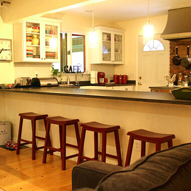
And finally, just a few more after shots:
So while it’s not my dream kitchen, it’s good enough for now. It will be interesting to see how long “now” really lasts. And if you thinking about selling your home in the near future, don’t you think it’s worth $200 to spruce up whichever your “problem” room is?
How have you updated a room that bugged you, but on a budget? In these economic times, lets share our decor survival tips!

 Paint Choice:


11 comments
I see that this post is 3 years old but wanted to say KUDOS! The new-ish kitchen looks really great for a $200 budget… love the fork and spoon above the cabinets 🙂
You really did an amazing job! It can be simple to update things with a little cash. We did it in our home by moving the refrigerator to a better location, adding a corner shelf, installing modern cabinet pulls, upgrading the counter tops, and adding matching stainless steel appliances. We also warmed up the color with a golden yellow that went well with the oak cabinetry. Since I didn’t want to spend the money replacing the medium oak cabinets, I considered painting them. But as it turns out, they are not the best product to paint. I had several painters and contractors tell me that it wasn’t such a great idea. So I decided if I couldn’t change it, I would go with it. So since I love the country style anyway, I decorated with some old rustic signs and decos and it really made it feel like home. We spent a bit more than you, but still did it on a low budget. So be inspired and give your space a lift to make it feel like yours!
If I can make one comment about your makeover, did you ever think of tiling your island? I just recently went into a newly remodeld old cafe, and they did it to their bar with muted tones of glass tile…..beautiful results! I never saw it done before and it was very stunning and I’m sure it was done reasonably. The white of your island base just stood out to me and it looked like an idea place to add this finish. If you would like me to send you a picture of it, just let me know!
Very nice kitchen. I have been looking for some ideas. I love the letter display “CAFE”. Do you mind sharing where you got it from?
This is one of the nicest designs I’ve seen. Great transformation. The paint goes along with the flooring and the furniture used are great and cozy than before. There’s this comfortable effect especially when the lights turned on at night where the flame light is very relaxing to have in the dining area. This is great!
Omg looks like the kitchen got a new face lift. A classy one that is!! Your creativity in the smallest areas gave your kitchen a new look. My kitchen looks horrible after seeing yours. I will definitely use some of these tips to improve my kitchen. Thanks for the post.
Your kitchen has the latest infrastructure. It shows the efforts that you have put to make it more beautiful in your budget. Your innovative ideas gave me the tips that how I can make my kitchen beautiful and attractive while spending less amount. Thanks for your innovative ideas.
Wow. What a smart move. That is seriously a dream kitchen. I am blown away, really. What ideas to compliment each and every nook and corner. A job well done. Bow.
The right choices in every little thing creates magic towards the kitchen. The color, furniture, fixtures, and even the accents compliments each other which makes the kitchen a stand out.