I’ve been house hunting the past two months, and I’ve seen my fair share of awkward spaces over kitchen cabinets.
You know what I’m talking about – they tend to look like little boxes super-glued to the wall with accessories stuffed above them. Allow me to illustrate:
But I’m going out on a limb here by saying that loading that space with accessories just because it’s there is a bad idea. If you’ve got high ceilings and a couple feet above the cabinets to work with, you have more options to create some interesting vignettes. But it should fit your design strategy – not just be filler.
So I thumbed through my “inspiration folder” of kitchen ideas from my favorite design magazines.
Nope, not a one showed filler up there. Rather, the cabinets in the designer kitchens either extended up (mostly) to the ceiling, or they allowed the space to breath.
Reality check…most of us are not going to run out and replace all our cabinets because of this “situation.” So let’s see what we can do with what we have! Here are some helpful do’s and don’ts to get you thinking:
Kitchen Cabinet Do’s
Blend!
Minimize the color contrast between your cabinets and the wall above them. White cabinets work well with this strategy. Consider painting your cabinets so you have more options. It’s not a coincidence that many designer examples I found showed painted cabinets. Add crown molding – the texture of the molding make the awkward space seems more intentional. You can also extend the cabinets further upward with matching panels/molding.
This example shows nice crown molding and a nice blend of wall color with cabinets. Very simple and it really finishes off the space.
Photo Source: Cottage Living
Light up!
Add lighting that points up to add drama without clutter. Rope lighting is easy and adds a nice glow. Shout out to Thrifty Décor Chic for her vision and fortitude! Note her smart use of vignettes – she has enough space to create nice arrangements. I especially like her use of vinyl lettering.
Photo Source: Thrifty Décor Chic
Distract
Look…it’s George Clooney! (Just kidding). Create a focal point that distracts – colorful rug are an easy distractions. Other ideas: bright red bar stools, amazing chandelier, powerful artwork, etc.
These examples are from FLOR – colorful carpet tiles create a wonderful focal point (and are very durable too!).
Photo Source: Flor.com
Look up!
Paint the ceiling, or extend the paint color above the cabinet to the ceiling. Sky blue is an ideal choice for this strategy.
Photo Source: Apartment Therapy
This example shows a painted ceiling to compliment the cabinets, plus the painted island made a nice focal point. A very smart, fresh design.
Photo Source: Coastal Living
Kitchen Cabinet Don’ts
There are two key no-no’s that I saw time and again while house shopping and I just CANNOT keep silent any longer:
- Friends don’t let friends use superfluous faux foliage of any kind “up there”. Why taunt dust?
- No borders – it calls attention to the awkward space and makes the ceiling seem lower. Don’t make me call the border patrol on you! 😉
Hopefully you found a few ideas to help make your kitchen BETTER for you. I’ll leave you with one last idea…you could just give up and go without any upper cabinets at all. Toast or tea anyone?
Photo Source: MyHomeIdeas
What design strategies have you used for that space “up there?”
*Update*
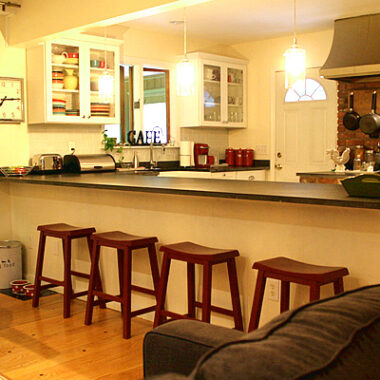
I finally got around to implementing a quick fix to my own kitchen “up there” problem. Check out My New-ish Kitchen post! Hint – my kitchen is the top left pic in the first image in this post. Yikes!



18 comments
Do you have a picture of the mirrored space? !
If you are going for finest contents like I do, just pay a visit this
web site every day for the reason that it offers quality contents, thanks
Instead of in coffee cans, sorting situations work a a full lot preferable to carry things operated.
My web blog Tool Chest
Does anyone know the name of the ornamental railing type item/object
that goes along the top of the cabinet? Kinda looks like a miniature
bar foot rest? and is usually about 4-6 inches high? I used to know the name, but its been a good number of years, and I have forgotten.
Thanks anyone who knows what I am referring to.
No faux/fake plants – they are dust catchers and scream of a past decade century. I use the space for my Fiesta pitchers and bowls. I like to think they’re artfully arranged, but it is admittedly a little busy. Guess it’s time to “prune” the bowl collection. I’m wondering if it’s possible (or advisable) to retrofit 12″ cabinets with glass doors above my cabinets. (They were barely a notch over builder grade for this 3200 SF home built 6 years ago.) I’m pretty sure I can find the same finish and design at one of the “big box” stores.) Has anyone attempted this? There is crown molding to remove but as far as I can tell, it should come down with minimal effort or “scars.” If that isn’t possible, what else can be done above the cabinets? (I’m dealing with 9 or 10 foot ceilings so there’s a lot of empty air space if I leave it empty.) I’ll take a pass on the no-upper-cabinets. I actually cook and USE all the dishes in my cabinets. I think the trend toward open shelves and no upper cabinets may look pretty but it’s not practical. Thanks for a good read!
Dusty fake plants are such a disaster. I like the lighting idea!
I love the lighting idea. I have one area above the cabinets I want to decorate. I took down the folage – yuk – it was gross! I have gathered all my platters that I have a hard time storing and want to enjoy. They are white or blue and white. In front of the yellow wall I think they will look nice. We will see!
I collected baskets for cooking when I lived in Japan, but they are so difficult to store here. I display them above my cabinets and intersperse them with large pieces of my wedding china, like the soup tureen, turkey serving platter, and teapot. I don’t feel guilty about having them take up cabinet space and they are just so pretty to look at.
I like the lighting idea and completely agree on the faux foliage. All I can think about is all the dust mites waiting to fall into your food *shudder*
Hi there. Found you through Struggling to be Stylish. I just did a post about ripping out the upper cabinets in an older home (showing what Pure Style Home did) unless the cabinets go all the way to the ceiling. I too cannot understand why you would waste space and put faux plants up there to get dusty. We actually bought mirrors from IKEA and mirrored that whole section. It reflects light, to make the kitchen not so dark. We just got rid of wallpaper and painted the walls a lighter shade. Once we do the cabinets, it should be a big change.
Love all your “above cabinet” ideas. That space is hard to deal with. Less or none at all is what I like.
Great post Susan!!
Well Susan, until now I had forgotten about that area. I set it with a couple of clusters of favorite copper pieces (years ago!) and sort of forgot about it. It gets cleaned once in a while. I can see the benefit of having it empty up there or just something minimal. I suppose its time to burn the fake greenery? Thanks for bringing this up. (I mean that in a good way!)
Nice article. I love your use of pictures along with your great writing style. I have those nasty spaces above my cabinets and confess that they are filled with things I haven’t used or even looked at, for years! And as Erin put it, its nasty up there! 🙂 Jean, itsrustic.com
Ohmygosh NO cabinets up top? ahhh I’d die! Love the suggestions!
xoXOxo
Jenn L @ Peas & Crayons
LOL – I couldn’t have said it any better…mocking is a great word for that. Thx for the chuckle (on my birthday, no less!).
I like your idea of display boxes – but yes, that sounds like more work than dusting! 😉
I hate that space. It mocks me. It says, “Ha, ha. You have an itty bitty house and I’m taking up about 400 cubic feet of space that you can’t do anything with unless you want it to be a greasy, dusty disgusting mess!”
Seriously, have you ever looked on top your cabinets? I hadn’t until I painted the wall behind them and OMG … nasty!
I’ve seriously been considering building “display boxes” to go up there, taking off the existing molding in the top of the cabinets and replacing it with some kind of flat molding (to hide the seam between the boxes and the cabinets), putting crown on top and then lighting the crap out of it. But that sounds like so much work. So I just pretend I don’t see it.