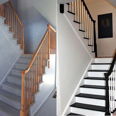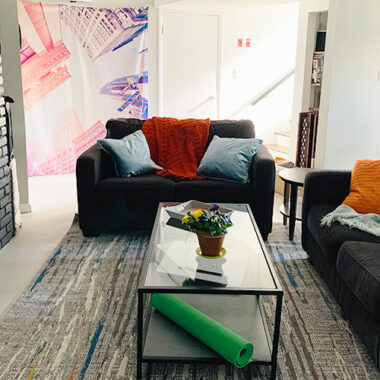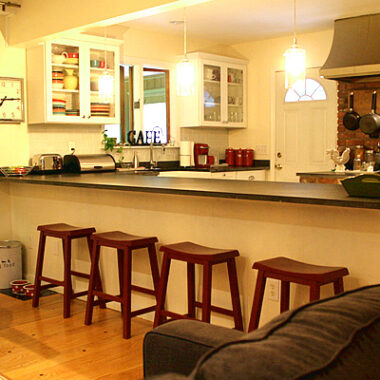
- Paint it
- Rearrange it
Painting is inexpensive, can be done in a day, and naturally “cleans up” a room while giving great color impact. Yea! Rearranging does the same thing, but here’s where it edges out painting…it’s FREE and can be done in about an hour! Woot woot!
So if you only have an hour or so, get out your tape measure and Moving Men discs and stir things up! Need ideas and inspiration? Check out HGTV’s Rearranging 101. Oh, and yes…number’s 4, 10 and 12 are my work {insert big cheesy grin here}! 🙂
While we’re on the subject, I had previously published an article entitled “Easy Measurement Formulas for Comfortable Design” – sort of a design-by-the-numbers guide. For your convenience, here are the highlights:
Furniture Arrangement
- Allow 2′ for walkways, and try not to force walkways through a conversational space.
- Leave 14″ to 18″ between the sofa and the coffee table.
- Reserve 2′ behind dining and desk chairs, and allow sufficient space for drawers to be opened.
- The conversation zone should be contained within an 8′ diameter.
- The distance from the TV to seating should be three times the size of the screen. For example, to watch TV on a 32″ screen comfortably, allow 8′ between the TV and the seating area.
Hanging Art
- Most people hang art too high. While the normal advice is to hang art so that the “normal” eye level (5′ 7″ to 5′ 10″) hits it one-third from the top of the art piece. However, you should also consider the type of room and how the art will be viewed. For example, hang living room art lower to appeal to seated guests, foyer art higher for standing guests, and kids rooms art a bit lower.
- Bottom line – use common sense, and when in doubt, hang it a little bit lower than you think you should.
Hanging Lights
- The sum of the length and depth of a room (in feet) equals the ideal width of your light fixture in inches. For example, a hanging chandelier in a 14′ x 12′ dining room should be 26″ wide. A hanging pendant in a 10′ x 10′ foyer should be 20″ wide.
- When hanging a light over a dining room or kitchen table, the bottom of the light should be 28″ to 32″ above a dining or kitchen table. Hang it lower for contemporary designs or intimate settings, and higher for larger tables.
Hanging Curtain Panels
- Your goal is to hang them so that the bottom of the panel lands right above the window sill, or go all the way to the floor (not in-between!).
- The higher you hang your panels, the taller the room will feel.
- Hang them about 3″ beyond either side of the window. This makes the window appear larger, and allows for more natural light to enter the room when the panels are open.
- Double Rods are great if you’re hanging sheers behind panels. Just make sure the sheers are the same length as the panels.
Area Rugs
- When placing an area rug in a dining room, measure your table, and then add 24″ to 30″ all around (or about 4′ to 5′ in total length and width). This makes it easier for guests to move their chairs around. Consider casters on the bottom of the chairs to help them move more smoothly.
- When using a room-sized rug on hardwood flooring, leave at least 8″ of exposed hardwood showing around all edges of the rug.
- If you’re using an area rug in a sitting area, make sure it is anchored by the front legs of the furniture, and not floating in the middle of the room.
Now remember, these are guidelines, not hard-and-fast rules. Do what works for you! Still not getting the results you want? Go with plan B and PAINT!
How have you shaken up a sad little room?


7 comments
Hi Kelly – I did the same thing for a client last month…it opened up the room AND made better use of the views!
Lots of good tips, thanks for sharing 🙂
It really is amazing what a difference rearranging furniture can make to a room. A few years ago, we flipped around our sofa and TV in the family room, and it made the room cozier and a lot more functional.
Kelly
P.S. I watched Color Splash yesterday. Didn’t love the overall design, but there were some cool element and lots of colour 🙂
Oh…you SO made my day! Yes…more to come this fall…summer got crazy and well, you know how it goes.
My next post will cover color trends for 2012…and here’s the best part – I’m moving, so I can really personally take advantage of color trend info! 🙂
Susan
Any new posts coming soon? I’ve missed you this summer.
I love it. I love playing around with furniture and rearranging. Great advice to see some change in a room!
Hi Donna,
It’s those pesky little details, isn’t it! I’m honored you bookmarked me! 🙂
Susan, I bookmarked this blog. Even though I know many of these measurements, I never knew the ones for the size of a chandelier relative to the room, and for the size of the conversation area I’ve always relied upon my eye, but this is a good tip for those DIYer homeowners who don’t have the eye that I have. Thanks.