Hmmm, what to do with this pink, isolated, formal living room off the foyer. In staging, we call this a “first impression” room.
Why not cut an entry way into the neighboring family room to make it feel more a part of things.
Not only does it bring oodles of natural light into the family room, it made the space feel much larger.
Ok, so now what? Because we’re saving up for a new kitchen, I didn’t want to spend much in this room. It’s a classic “use what you have decorating” challenge. Here’s what I had to work with:
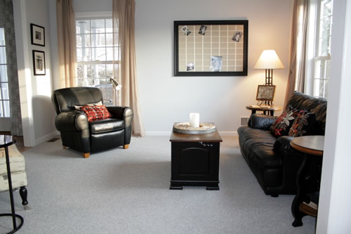
- My husband’s vintage bachelor black leather furniture (love seat and recliner)
- Coffee and End tables from our last home
- A few mis-matched lamps
- Whatever accessories I had in stock
- I allowed myself a budget of under $1,000 to cover window treatments, any additional furniture and accessories.
That’s ok. I like a challenge. Here was the plan:
Inspiration: We have been working on a wine cork project which became the inspiration for this room. I like the metal rim, neutral tones in the corks, and black/brown/orange accents.

- We painted the BM Pearl River gray and the ceiling white (yes, the ceiling was pink too).
- We kept the gray carpeting since it was in decent shape.
Windows:
We softened the black leather by adding textured linen window panels (found a great deal on Overstock). The linen color (and texture) tied in nicely with the wine cork art piece.
- We used the same bronze hardware as in the adjoining family room for consistent flow between the rooms.
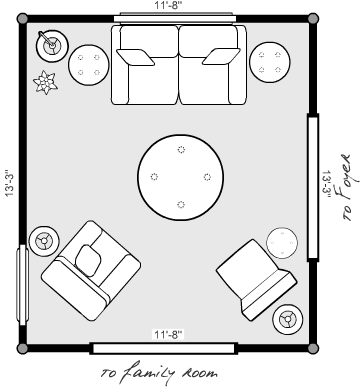
Layout: We created a conversational area that utilized the entire room. I’m still looking for a large, round glass coffee table to bring the grouping together more. I’ll center it with the wine cork art piece. But you just can’t rush a good find. Our “old” coffee table is fine for now.
Furniture: We picked up a chair at HomeGoods, and along with a funky side table from Pier 1.
Accents:
- Color: With all those neutrals, we had to add some color. We used warm orange accents to add a touch of contemporary color. Note: we had a bunch of warm orange accent pillows already, which confirmed it as a logical choice. I did purchase a solid velour pillow for the HomeGoods chair since it had a busy pattern.
- Lighting: We used two brushed silver pharmacy lamps for task lighting, and one black floor lamp.
- Down the road, I’d like to add built-in bookshelves along the wall to make it more of a library, but for now, I found a great deal on a large bulletin board (yes, HomeGoods again). It had all the elements I was looking for: black frame to tie in with the furniture, textured linen background to tie in w/the curtains, and cream ribbon to tie in with the new chair. By hanging black and white family photos, it blends well with the gray walls. We’ll work on adding more black and white photographs to the bulletin board – the kids are getting a kick out of seeing the pictures change frequently – so I guess I’ll keep ‘em guessing.
Before & After
Without further adieu, here are the before and after shots:
Views from the foyer



Since we opened this room up to the family room, it’s important that it flows well between rooms. Here are the “back and forth” views:


Ok, here’s the part where I candidly share my budget:
- Paint: $40 (Benjamin Moore)
- Window Treatments: $400 (Overstock for panels, Crate & Barrel for hardware)
- Accent Chair: $200 (HomeGoods)
- End Table: $75 (Pier 1 – used my “new to the neighborhood” coupon)
- Bulletin Board: $40 (HomeGoods)
- Velour Pillow: $20 (Pier 1)
All that for $775! That leaves me up to $225 to spend on a round glass coffee table. I’ll keep looking. But for now, the living room is finally livable!
Note: I’m not counting the costs for cutting the entryway into the wall since I included that in the family room makeover budget.
I wouldn’t call it a formal living room anymore, but rather a comfortable place to read or hang out. If you have an underutilized living room, here are some unique ways to repurpose it.
And do share…what do you use your living room for?
ps – wanna see more before & after posts? Visit Thrifty Decor Chick’s B&A Party…


 We softened the black leather by adding textured linen window panels (found a great deal on Overstock). The linen color (and texture) tied in nicely with the wine cork art piece.


8 comments
Thanks!!!!
Thanks Cara,
It’s so important to have a house that works for whoever lives there. Toys will be toys, so might as well give them a place, right?
This is a beautiful room. What a great idea to make an opening to the family room. Our living room gets used for lounging, visiting, reading, playing games and puzzles. With 3 kids in the house, it’s well-lived in and I don’t sweat the toys in the room.
If we are decorating our home especially with the floor covering we just turn out for the carpets and rugs. There are so many kinds of room in the house but one that gives the best attention to us is the kitchen. It is considered as the heart of the house. In this room takes place the cooking and preparing of the food that is why it is required to have high standards of cleaning and light.
Very beautiful! I wish for many happy moments in there!! 🙂