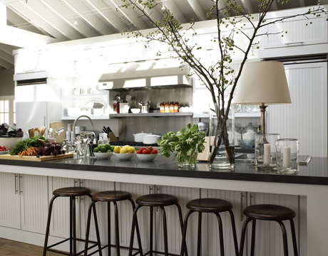
Seriously, this week’s reveal of the House Beautiful Kitchen of the Year for 2009 did not disappoint. Ina Garten (Barefoot Contessa) inspired a space I could easily learn to call home!
Here are some of my thoughts about it:
Pros:
- Belly up to the counter = fewer steps for cleanup, and a great place for guests to hang out!
- LOVE the black and white contrast.
- Beadboard and ceiling add subtle architectural interest and texture without being overwhelming (for some reason that was really fun to say).
- I like the “homey” lamp on the counter – an cozy unexpected touch.
Cons (just a couple…and it’s probably just me):
- While the “tree” is very pretty to look at, it would drive me bonkers in real life. But great focal point if you’re having a party (which this is).
- The island is rather long; I might tire of running around it to get to the other side if I forgot something or if I am chasing the kids. Maybe a canal in the middle? lol
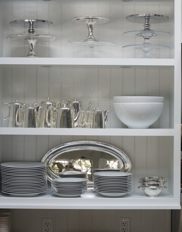
I’m a big fan of open cabinets. Admit it – opening and closing cabinet doors is a pain. But I would need to make sure I had nice dishes. 😉
But I believe there are some cabinets that need doors to hide the less-attractive kitchen items. I personally like a mix of open, closed and glass front cabinets.
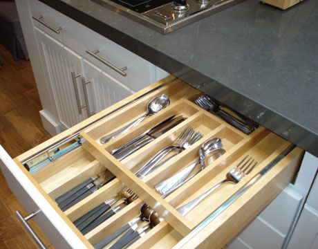
I’m truly salivating over this two-tier flatware storage concept!
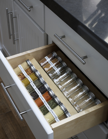
And how much better is this for storing spices! Sure beats spinning a lazy susan (I dislike that term) around in a corner cabinet!
(Little bragging note here: I moved my spices to an expandable organizer in my kitchen drawer a year ago, and it darn near changed my life – or at least my outlook on cooking).
One constant about kitchens – you always need a command central space to avoid the inevitable corner of clutter. This one is very pretty, but I personally think it needs more emphasis on storage of paperwork. Just sayin’.
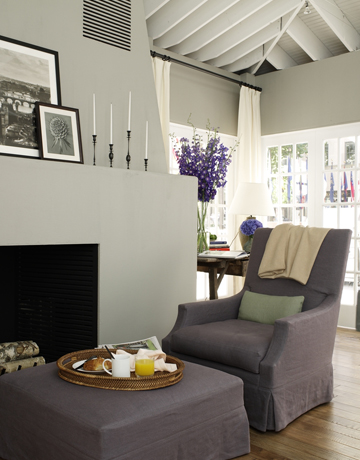
There is a trend towards including living spaces in the kitchen (since everyone hangs out there anyway). I love the colors and simplicity of this design. I especially like the candle holders.
While I still have my eye on my own personal Dream Kitchen, this has given my lots of ideas to add to my laundry list of wishes.
What do you like (or dare to dislike) about this kitchen? How does it compare to past winners?
I don’t know about you, but I’m inspired to try one new recipe per week now.
Thanks Ina for inspiring such a fabulous kitchen, and a big thanks to House Beautiful for making it happen and letting me share this with you! Looking forward to KOTY 2010!
One last note: if you’re not already following House Beautiful on Twitter, you should! www.twitter.com/house_beautiful.





18 comments
Wow…a kitchen on wheels? Not sure I understand…
A portable kitchen comprising:a primary compartment and at least one subcompartment for receiving at least one article to be packed therein, the primary compartment and the at least one subcompartment being formed from a water-resistant material, the at least one subcompartment being removably attached to the portable kitchen, the primary compartment being bi-valved and having a hinge adapted for pivotally opening and closing the primary compartment; a retractable handle assembly located along a top of the portable kitchen; and a plurality of wheels located adjacent to a bottom side of the portable kitchen, wherein the primary compartment and the subcompartments each have a plurality of retainers, each of the retainers being adaptably configured to hold a kitchen utensil, cooking ingredient, or cookware, and wherein at least one of the subcompartments is configured to organize and retain a plurality of cylindrical containers
I love a big kitchen project! Good luck with it!!!
This is awesome! I haven’t seen it yet. sort of what I’m going for but on a much grander scale.
Oh wow…I see what you mean about the handles! And re: the island cabinets – I wonder if there is access to them from the other side?
Now I do like the lamp because it’s unexpected. I thought the cooktop was on the other counter (can’t tell from this pic).
Thx for your excellent comments!
Love the open upper cabinets, Caesarstone counters and beadboard cabinets; hate the handles (especially under the island) they catch on clothing (speaking from experience) and the stainless steel finish is too cold against the warmer tones of the range and hood. I think it would be awkward to get under the island to reach into those cabinets, too.
A styling comment: There’s way too much clutter on the island and a lamp next to the cooktop? Seriously? That bugs me for its safety issues as well as its impracticality
.-= Jane @ Beach House´s last blog ..Clothkits =-.
This is awesome! I haven’t seen it yet. sort of what I’m going for but on a much grander scale.
.-= Jenny Kerr´s last blog ..My "New" Library Window =-.
What a gorgeous kitchen. How could you not be inspired to cook in such a space? Or at least call and order some really good takeout and eat it off lovely china!
Cass
.-= Cass @ That Old House´s last blog ..A $65,000 Kitchen Giveaway and Two Birthday Cakes To Share =-.
I love the ceiling and the fireplace! I would just add a little more color–may a tile backsplash. ~Tracy
.-= daily decorator´s last blog ..Set The Table =-.
I like the tree as long as it doesn’t poke me in the eye. I think it’s the height and textures in the tree that I like. The counter itself it so long that they had the “style” the daylights out of it or it would be a cold looking place. Can you imagine the counter top cleaned off?
.-= Terry´s last blog ..Before / After =-.
I could live with that kitchen 🙂 I really like the ceiling, and look at all those cabinets in the island!! Love the countertop — it looks like a dark charcoal gray. And great gooseneck faucet.
Kelly @ DesignTies
.-= DesignTies´s last blog ..Hooked on… summer fun & giveaways!! =-.
I can only dream of all that storage…, and organization. It’s a beauty for sure! And BTW after repeating it (Adirondack) over and over, I’m finally able to say it right without “thinking”. Have a great weekend!
.-= Maya@Completely-Coastal´s last blog ..The Adirondack Chair -From the Mountains to the Hamptons =-.
I am visiting from Julia’s Hooked on Party. Thanks for sharing!
Yeah, organized spices are the spice of life! lol I just had my little kitchen fairies help me with mine (see my hooked on post).
The tree would bother me too.
.-= Bridget´s last blog ..Hooked on Improving =-.
I would love to switch my traditional kitchen to black and white…but I think it will take a move to get it done! 🙂
.-= Susan´s last blog ..kitchens & dining | What do you think about this year’s winner? =-.
I’ve been drooling over this kitchen for a few days but I gotta agree with you on the Cons.
I’m contemplating changing up my own kitchen with white paint but I’m finding it hard to take that first step. At least looking at pretty photos is easy and painfree! LOL!
.-= astrid´s last blog ..* Mt. Horeb and Blue Mound State Park =-.
That island is really long! I like the white beadboard and the drawer storage ideas!
.-= Jenny´s last blog ..Hooked On Fridays: Homeschool Deal & Giveaways =-.
I hadn’t seen this yet! It’s beautiful. Good point about the long island, though. Hadn’t thought of that, but you’re right. Might get old having to walk all the way around it each time. Other than that, I love it.
.-= Julia @ Hooked on Houses´s last blog ..Hooked on Outdoor Dining =-.
I was just catching up on the KOTY earlier today, and also noticed the B & W theme. We have over 200 kitchen inspiration photos on Atticmag and the B&W ones are still our top draw. One thing I always like are the clever drawer organizers, like the spice drawer you show above. It’s the simple things that keep me happy, lol 🙂
.-= Atticmag´s last blog ..Recipe – Pasta Lover’s Potato Salad =-.