Every home has that one room where everyone tends to hang out. And usually it’s the family room.
I didn’t get that good vibe when I first toured the family room in this home as a prospective buyer. It was dark and felt closed off from the rest of the house.
The floor, walls and ceiling were medium gray. The trim was cream, and the heavy window treatments made it even darker (and hid the fabulous view out back). It also felt closed off to the rest of the home. The door to the side porch seemed misplaced and created a traffic flow issue.
So here was our plan to lighten the place up:
First, we cut an entry way between the family room and adjoining formal living room. This opened up the floor plan, and lets morning light pour in from the living room.

Next, we replaced the gray Berber carpet with hardwood floors to match the foyer and dining room. This allowed light to reflect off the floor, and will be easier to keep clean since it’s such a high-traffic area.
We hung window panels high to take advantage of the 9’ ceiling. We opted for 96” panels from West Elm that would still let lots of light in and not take center stage – we wanted open and airy, with focus on the view of the garden and waterfall out back. They added texture without calling too much attention to themselves. Note the gray pattern on the panels. That helps it tie in with the adjoining living room and the marble around the fireplace. We used bronze hardware from Crate & Barrel to match the heavier feel of the furniture.
Lack of wall space and having multiple traffic patterns in this room posed an interesting challenge for layout. We didn’t want to interrupt the conversational area, so we opted for a big brown soft comfy sectional that contained the conversational area.
We purposefully did not want to make the TV a big deal, so we quietly placed it on a low media table. The chaise part of the sectional is next to the TV, so we can still view it from anywhere in the room. Here’s the overall layout:
Then came the fun part…accessorizing!
Since the inspiration for this room is Birch Tree, we worked in spring green accents. As the seasons change, we can easily update the accessories to roll with the changes.
The mantel was intended to be the focal point of the room. We still need to raise the wire screen higher by hanging it on the wall. We want to keep it about 2 inches away from the wall to allow for interesting 3 dimensional shadows from candles and sunlight. I’m also going to add a lighting element to it. Also, since it’s spring, I moved a plant in front of the fireplace. But I’m looking for a couple birch logs to put in the fireplace off-season.
We’re still in pursuit of the right round coffee table, but for now, we find this room quite livable. Here are a few after shots:


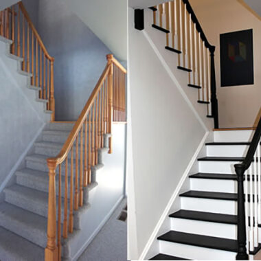
Here you can see where the painted stairs come into play. Here’s the post that shows how we did it.

Here’s what the stairs looked like before:
Ok, time to fess up the costs on this one. Yes, we did a bit more than rearrange and accessorize!
Here are approximate costs:
- Updates: $4,100
- Painting (DIY): $300
- Wood Floors (hired out): $2,500
- Entry cut into in wall w/molding (hired out): $1,300
- Furnishings and Accessories: $2,350
- Area Rug (from Overstock): $300
- Window Treatments (Panels from West Elm, Hardware from Crate & Barrel): $600
- Accessories (from HomeGoods): ~$200
- Furniture (sectional from Ashley Furniture and media stand from a local used furniture store): $1,250
So that comes to around $6,500. Yea, that’s a big number. But if the previous homeowners had done some of this work before it went on the market, chances are the house would have sold faster, and the final selling price would have been more than $6,500 over what we paid. Just sayin’! 😉
I’m declaring this room done (enough) so I can move on to other projects. Namely, the bathrooms. But first, I must finish the stair painting project.
Gotta go…paint brush is calling me!
But first…the movie version. 😉


23 comments
Howdy! This article couldn’t be written any better! Reading through this post reminds me of my previous roommate! He constantly kept talking about this. I’ll send this post to him.
Pretty sure he’s going to have a very good read. Thanks for sharing!
Thanks Amanda – here’s the post that shows you how to do it. It’s very easy, unless you have a lot of spindles (they are time consuming). Let me know how it goes!
https://yourhomeonlybetter.com/staging1/painting-stairs-diy-faqs-and-tips/
Great makeovers! I am interested in doing the same makeover to my staircase (except I have a lot less railing and carpeted stairs). Do you have any tips?
I appreciate your efforts but I think the color contrast is too much. The walls need a darker tone to offset your very dark sofa. I have a shaped sofa similar to your in an espresso colored leather. It “sucks” the light in but a sorta kinda white wall looks bleached next to it. Maybe a gray or deeper linen tone would make this more cozy and Family Room-ish…? (I’m an interior designer and I see the white wall/dark furniture a lot because of fear of traffic wear and tear)
Great job on the wall and flooring. Good luck with the next steps!
…and you are right about the selling price! You will appreciate these improvements when you go to sell!
Hi! I just read some of your blogs and I’m impressed!
I’m doing some DIYs myself for our dining & kitchen.. just finished repainting the walls and now I don’t know what window cover will work best for my old windows 🙁 Trying to get some ideas from the web and I stumbled upon your website…. hoping to be as creative as you are!
All the best!
Thanks…you hit the nail on the head…”easy to maintain.” Not that I’m lazy, just got other things to do. 😉
You have done a Brilliant work,colors palette looks Fabulous in Ur home…i adore those pictures,they are fantastic .. http://www.vivamagonline.com Your home is the most enjoyable place…Thanks!!!Furniture are very lovable..
This is a wonderful transformation! I love the mix of modern and traditional, it feels very comfortable, but easy to maintain.
ok Susan, DYING to see the stairs! 🙂
By end of week…please hold me to it! Nagging permitted!
Thanks Mom. 😉
Come visit soon!
What a difference! You made the family room a light and fun place to be.
What a difference! You made the family room a light and fun place to be.
Thanks Lisa!
lol – come on over and help…you’ll get over it real quick! Just kidding…it’s really almost done – just working on the spindles in the upstairs hall overlooking the stairs.
cannot wait to see/read the tips on the stairs! this may be my next project as well! great job!!!
Love it and I now have stair envy. 😀
I love it! Amazing eye for decorating.