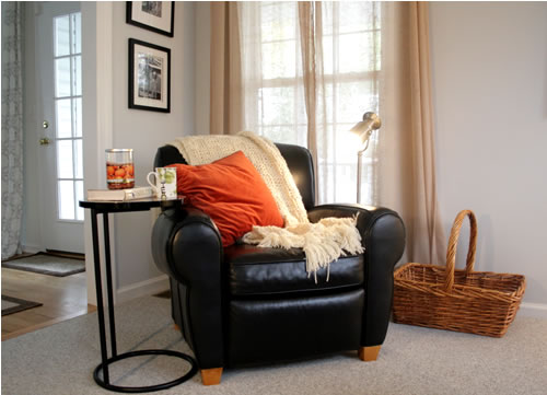
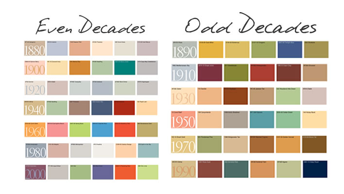
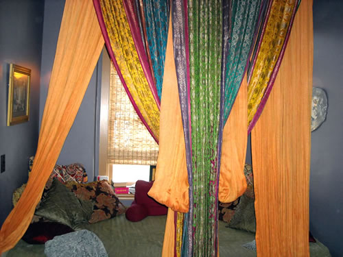
color trends

As you take down your holiday decor, be sure to bring in all the props you’ll need to stay warm until (perpetually elusive) spring arrives.  And color is a great way to make warmth happen!

Understanding what emotion colors represent, current color trends and practical ways to implement those colors just might help you make it through yet another winter.

Meaning of Color:

Color is both inspirational and influential. Stimulating hues can affect us emotionally, physically and yes, even behaviorally.

[click to continue…]

{ 1 comment }

A Color Story: By Decade

by Susan on November 17, 2010

in All About Color,Decorating

Color tells a story. It can even describe an entire decade. I attended a Benjamin Moore Webinar presented by Doty Horn (BM’s Director of Color and Design) about color trends over the decades in hopes of better understanding the context for the color trends that we see year to year. (note: Doty is a rock star, IMO).

But what I learned surprised me, which I’ll share with you at the end of this post (no cheating by scrolling down!).

There is an interesting rhythm of color over time. We tend to define time in decades, and illustrate them by external events and the aggregate emotional state of being at that time. There are wars, political changes, industrial and innovation changes, art and culture influences, and so on.

I’ll do my best to summarize each decade with key phrases, starting with 1880.

1880: Victorian Period, Grand, Glamour.

1880 Colors

1890: Innovation, Gilded Age, Art Nouveau, Mauve, Cobalt Blue.

1890 Colors

[click to continue…]

{ 4 comments }

A year ago, I attended Benjamin Moore’s ColorPulse 2011 and blogged about it here. 2011 Color Trends followed the theme of “Balance” illustrated through four trends: 1) Farm, 2) Order, 3) Escape and 4) Tribe.

After attending the 2012 ColorPulse event, I observed that some elements of these trends that are predicted to evolve into 2012, per the Benjamin Moore ColorPulse Color Trends report. Just as last year, these trends are a direct reflection of our environment.

There is an interesting trend identified in the 2012 forecast- Preservation. It is a curious reflection of our current economic and social climate. The overall desire to connect our past with our future. Perhaps context and relativity gives us a better sense of control in uncharted waters.

Preservation is broken out into 4 trends:

  1. Heritage – our past
  2. Process – our journey
  3. Protection – our vulnerability
  4. Enlightenment – our future

[click to continue…]

{ 51 comments }

Awhile back I shared a wonderful meditation nook I discovered on a “girls spa weekend” in North Carolina (see post here).  Simply put, it was a bed placed at the end of a hall for guests to relax in while in-between treatments. Of course the vibrant drapes and oodles of comfy pillows added to the experience.

So here was my “inspiration room” for a retreat area in my own home:

I decided to use a nook in our bonus room, which serves as our play room, guest bedroom and upstairs family room. This is the nook before I got ahold of it – looks like a daycare!

By switching things around, I used what I already had and created my own version of the retreat using lively colors that matched the spirit of the play room.

But after awhile, I tired of the kiddo vibe. After writing the Color Trends for 2011 post, I started thinking about how I could use color to change the impact of my retreat (and reclaim it from the kids!).  Plus, remember…this is also a guest room when needed.

I was really drawn to both the “escape” and the “tribal” trends – I wanted something with an organic earthy feel, but that felt light and full of possibilities.

So I did a couple (very inexpensive) things:

  • I updated the bedding to something very neutral and soothing (and yes, “on sale”).
  • I added roman shades for texture and to add privacy for guests (very easy project – they hang on regular curtain rods)
  • I recovered the body pillow with a playful giraffe pattern (which ties in with the chocolate brown sofa on the other side of the room), and switched out the pink pillows with other ones I had in storage.
  • I simplified the wall art to be serene and relaxing.

Overall, I spent less than $200 (just for the bedding, shades and curtain rod). Now we finally have a space that is more comfortable for guests, and I have my little corner of the world where I can relax.

Who knew…color really is that powerful!

{Next step – add a soundproof curtain in front of the nook that makes me invisible to the kids while they’re playing Wii across the room. Yea, wish me luck on that one!}

How have you used color to change the feel of a room?

{ 6 comments }