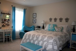
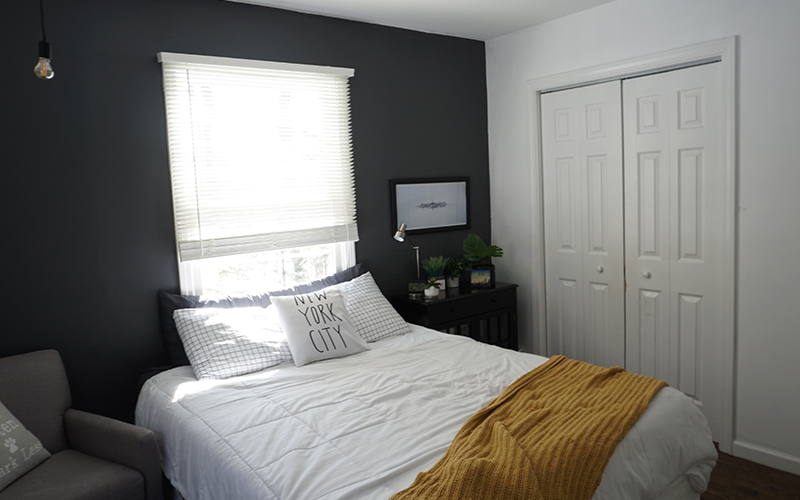
by Susan Jensen Smith on July 4, 2010
Got a sad, blah room in need of a quick pick-me-up? Good news…there are two ways to jump-start the energy in a room without spending a lot of time or money.
- Paint it
- Rearrange it
Painting is inexpensive, can be done in a day, and naturally “cleans up” a room while giving great color impact. Yea! Rearranging does the same thing, but here’s where it edges out painting…it’s FREE and can be done in about an hour! Woot woot!
So if you only have an hour or so, get out your tape measure and Moving Men discs and stir things up! Need ideas and inspiration? Check out HGTV’s Rearranging 101. Oh, and yes…number’s 4, 10 and 12 are my work {insert big cheesy grin here}!
While we’re on the subject, I had previously published an article entitled “Easy Measurement Formulas for Comfortable Design” – sort of a design-by-the-numbers guide. For your convenience, here are the highlights:
Furniture Arrangement
- Allow 2′ for walkways, and try not to force walkways through a conversational space.
- Leave 14″ to 18″ between the sofa and the coffee table.
- Reserve 2′ behind dining and desk chairs, and allow sufficient space for drawers to be opened.
- The conversation zone should be contained within an 8′ diameter.
- The distance from the TV to seating should be three times the size of the screen. For example, to watch TV on a 32″ screen comfortably, allow 8′ between the TV and the seating area.
Hanging Art
- Most people hang art too high. While the normal advice is to hang art so that the “normal” eye level (5′ 7″ to 5′ 10″) hits it one-third from the top of the art piece. However, you should also consider the type of room and how the art will be viewed. For example, hang living room art lower to appeal to seated guests, foyer art higher for standing guests, and kids rooms art a bit lower.
- Bottom line – use common sense, and when in doubt, hang it a little bit lower than you think you should.
Hanging Lights
- The sum of the length and depth of a room (in feet) equals the ideal width of your light fixture in inches. For example, a hanging chandelier in a 14′ x 12′ dining room should be 26″ wide. A hanging pendant in a 10′ x 10′ foyer should be 20″ wide.
- When hanging a light over a dining room or kitchen table, the bottom of the light should be 28″ to 32″ above a dining or kitchen table. Hang it lower for contemporary designs or intimate settings, and higher for larger tables.
Hanging Curtain Panels
- Your goal is to hang them so that the bottom of the panel lands right above the window sill, or go all the way to the floor (not in-between!).
- The higher you hang your panels, the taller the room will feel.
- Hang them about 3″ beyond either side of the window. This makes the window appear larger, and allows for more natural light to enter the room when the panels are open.
- Double Rods are great if you’re hanging sheers behind panels. Just make sure the sheers are the same length as the panels.
Area Rugs
- When placing an area rug in a dining room, measure your table, and then add 24″ to 30″ all around (or about 4′ to 5′ in total length and width). This makes it easier for guests to move their chairs around. Consider casters on the bottom of the chairs to help them move more smoothly.
- When using a room-sized rug on hardwood flooring, leave at least 8″ of exposed hardwood showing around all edges of the rug.
- If you’re using an area rug in a sitting area, make sure it is anchored by the front legs of the furniture, and not floating in the middle of the room.
Now remember, these are guidelines, not hard-and-fast rules. Do what works for you! Still not getting the results you want? Go with plan B and PAINT!
How have you shaken up a sad little room?
by Susan Jensen Smith on June 24, 2010
Pink is a beautiful, joyful hue that has been engrained in our minds as a “little girl color” – much as a dad’s favorite sports team becomes his son’s favorite teams. Do you think pink is most little girls’ favorite color because they organically love it, or because they caught on pretty early that it’s the “team” color that represents little girls?
With two daughters, we’ve had our share of pink rooms in our home. My older daughter loved pink, but “grew out of it” (whatever that means) as shown here. My younger daughter, however, associates strongly with the hue as shown here. As for me, I like pink, but doubt I’d ever convince my husband to live in it. Doesn’t mean I can’t try and sneak in a few accents.
Most grownups shy away from using pink in their homes because of these preconceived ideas that have been shoved down our throats by society! But for the confident and expressive souls who dare to view their world from rose colored glasses – it’s a wonderful way to add soothing warmth to their homes.
Plus, it fits in nicely with Benjamin Moore’s Color Trends for 2011, as explained here.
Love pink but not sure how to use it? Here are some colors that pair nicely with this blushing beauty:
- Green is a lovely complimentary color to pink. There’s a reason that pink and green owned the preppie era of the 80’s. Safe, but lovely.
- Yellow and blue also play nicely with pink. Experiment with various shades to find the combination that works for you.
- With bolder pinks, how about a side of tangerine or violet? Tempered with white it could be gorgeous!
- Since pink is simply a lighter shade of red, consider a monochromatic color scheme in that family. Think Valentines!
- Pink can be toned down with a dark neutral such as brown or black. White makes a great partner as well.
- Which shade is right for you? Pink can range from pale pastel/almost white to bold fuchsia, and numerous nuances in-between. Any of these beauties speak to you?

Selections courtesy of House Beautiful
Take a tour with me through some amazing pink rooms that just might change your subconscious mind about the color pink. No rose colored glasses necessary here!
The most common place you’ll find pink is in a bedroom. Here’s a lovely, eclectic room with a great sense of expression. How could you not love that pink canopy!

Photosource: Flickr
Love bold pink but want to tone it down? Whitewash it!

Photosource: Southern Living
But are you bold enough to make your living room blush? Interesting to note that the blues, greens, yellows and blues play nicely with the pink and tone’s it down a bit.

Photosource: House Beautiful
Here’s a great example of pink as an accent. The red/pink in the curtains tone down the girly-factor a bit. What do you think about the pastel pink cabinet? I love it. It’s a bold move and adds softness to the room.

Photosource: Country Living
Here’s a great example of playful pink for grownups! Love the high ceilings, valiant shade of pink and the lighting in the dining room is amazing!

Photosource: Apartment Therapy
Could you see yourself enjoying tea and scones in this dining room? What about steak and potatoes? The nautical feel of the stripes tones down the girl vibe a bit, and the hanging pendant is fabulous.

Photo Source: Coastal Living
I’ve been dreaming of a beach blue kitchen {sigh…some day} – but this pink and white kitchen caught my eye – might those be the appliances I blogged about here? I really think the mixer adds the finishing touch! The blue plays nicely in this room as well. I really like this one!

Photo Source: Coastal Living
And what pink dwelling would be complete without this fabulous porch? A simple addition of pink and white stripped pillows makes enough of a statement. Even without the view, it’s lovely!

Photo Source: Coastal Living
Even if I can’t gain consensus to pink-a-fy my home, I’ve got my eye on this little beauty for the summer! Just needs a basket on the front and I’m good to go!

So if you like pink…go for it! No apologies! Express yourself with confidence.
So have I convinced you? What’s holding you back?